SERVICE DESIGN · Benchmark - information Architecture

From Complexity to Clarity

How I architected a medical device product line from chaos to a sales-ready offering in 3 months.
THE CONCEPT: YOU MOVE TO DISCOVER, AND DISCOVER BY MOVING

MY ROLE

UX/Service Designer, Product Architect

Year

2024 - 3 months (Internship)

Team

3-person core + Digital group

Context

Figma, Google Analytics, Competitor Analysis

THE PROBLEM

Rehabilia had all thepieces. But no narrative.

4 core products. 6 handle variations. 8 interactive games. Vision system. 4 pricing models. How do you help a hospital or Clinics decide what to buy?

Rehabilia is a spin-off from Italy's National Research Council (CNR), building gamified neurorehabilitation devices. The technology was cutting-edge. The product architecture was complex. But the go-to-market story? It didn't exist.

As an intern UX/Service Designer, I was brought in to translate that complexity into clarity—something sales teams could demo, clinics could understand, and investors could fund.

Step 1: Foundation

Building the website information architecture.

Before we could sell, we needed a single source of truth. A place where a therapist, clinic director, or investor could understand: What is PhiCube? How does it integrate with RehaGrips? What does a "Premium Package" actually include?

We conducted:

Competitive
Matrix

5 rehab-tech vendors

Feature analysis Pricing models Customer positioning

Product Dependency Map

PhiCube (core)

RehaGrips (modular) Game Library Vision System

Information Architecture

Site taxonomy for

100+ SKUs → 4 packages Labeling, hierarchy, product categorization

and structured the site hierarchy: Core Device → Modular Handles → Game Library → Vision System → Service Tiers.

The result was a website that answered the question before anyone had to ask it.

Step 2: Sales Materials

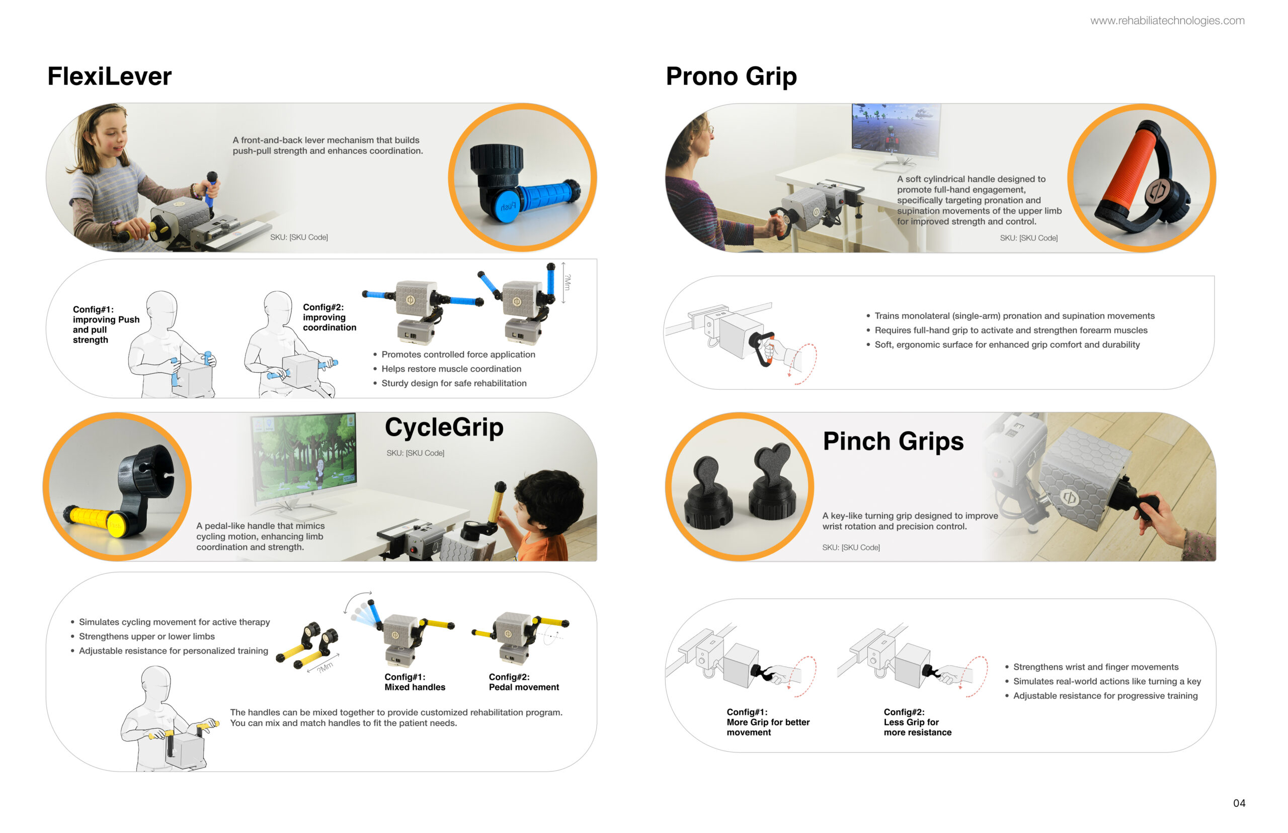
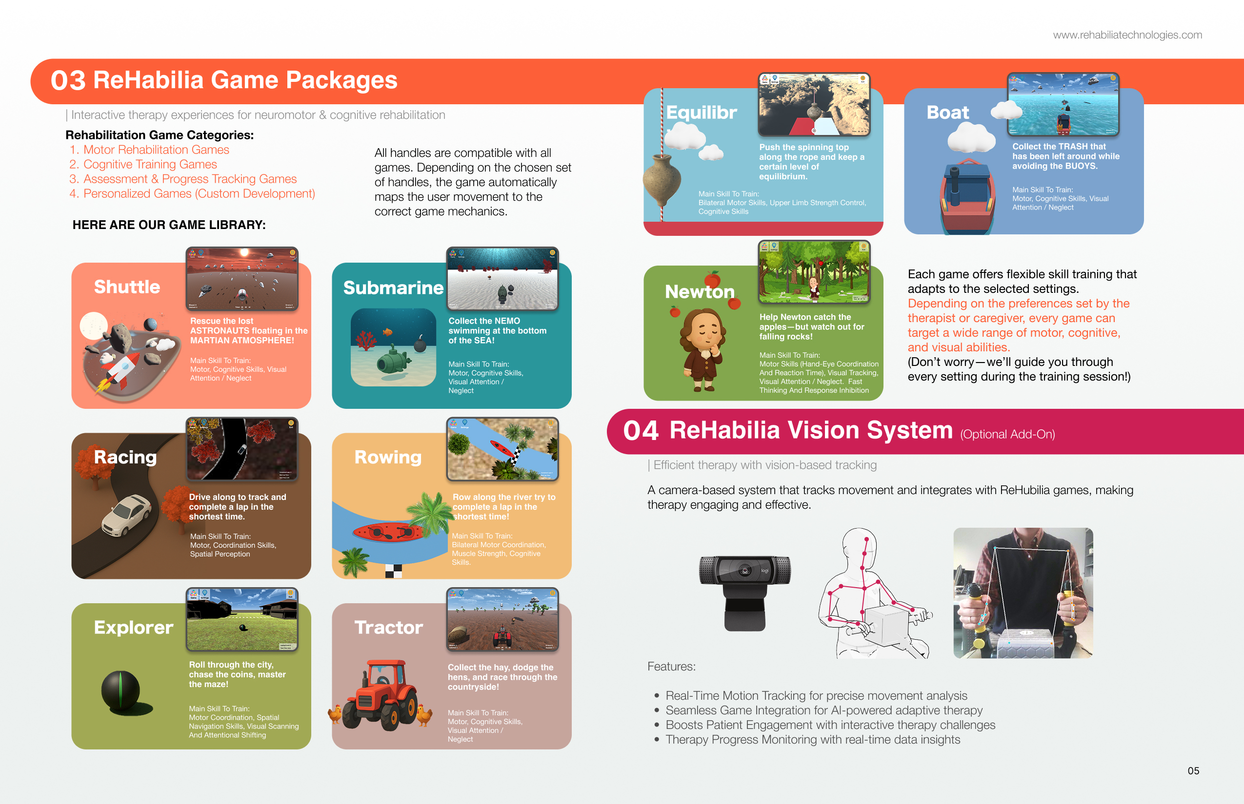
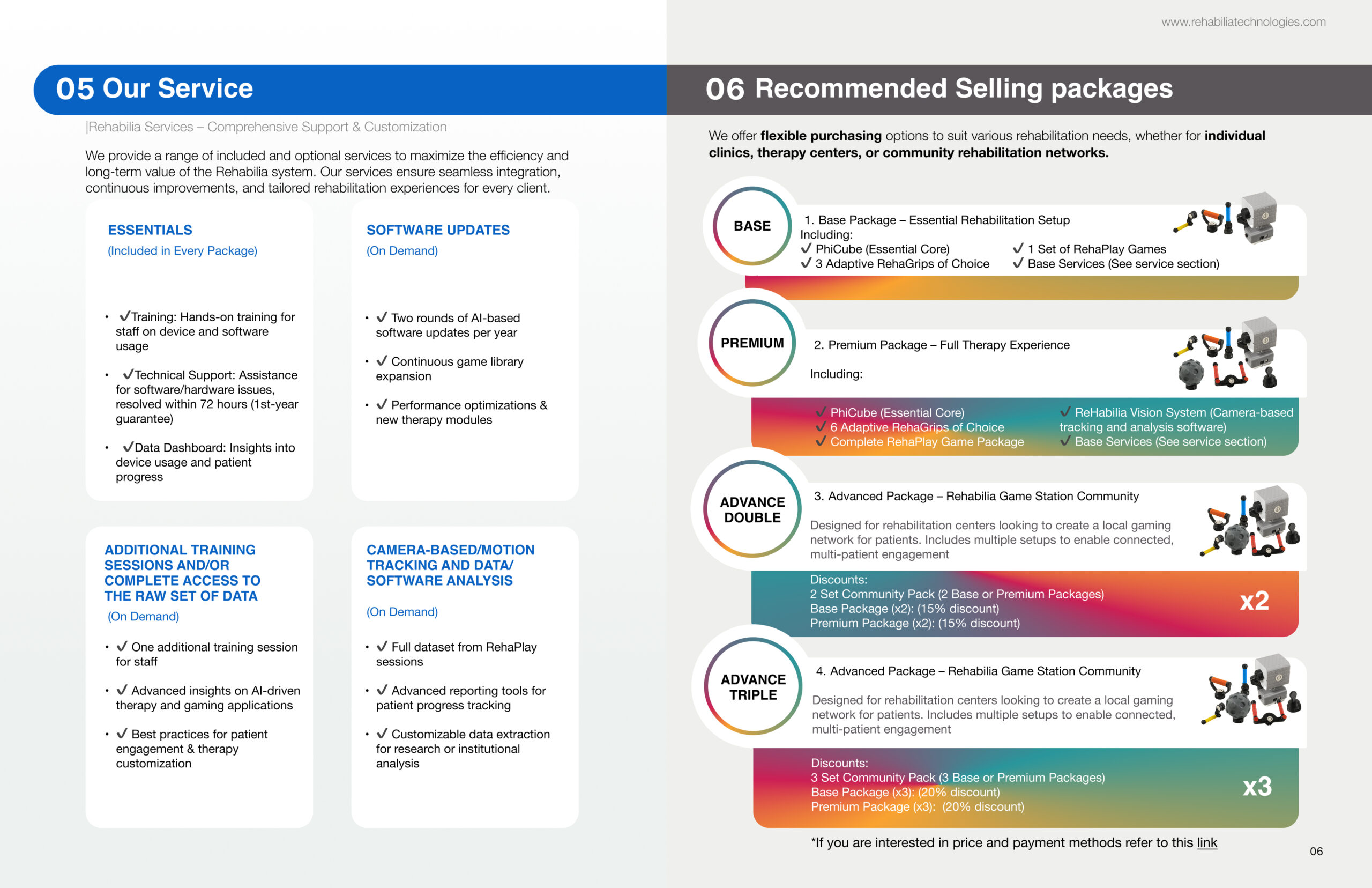
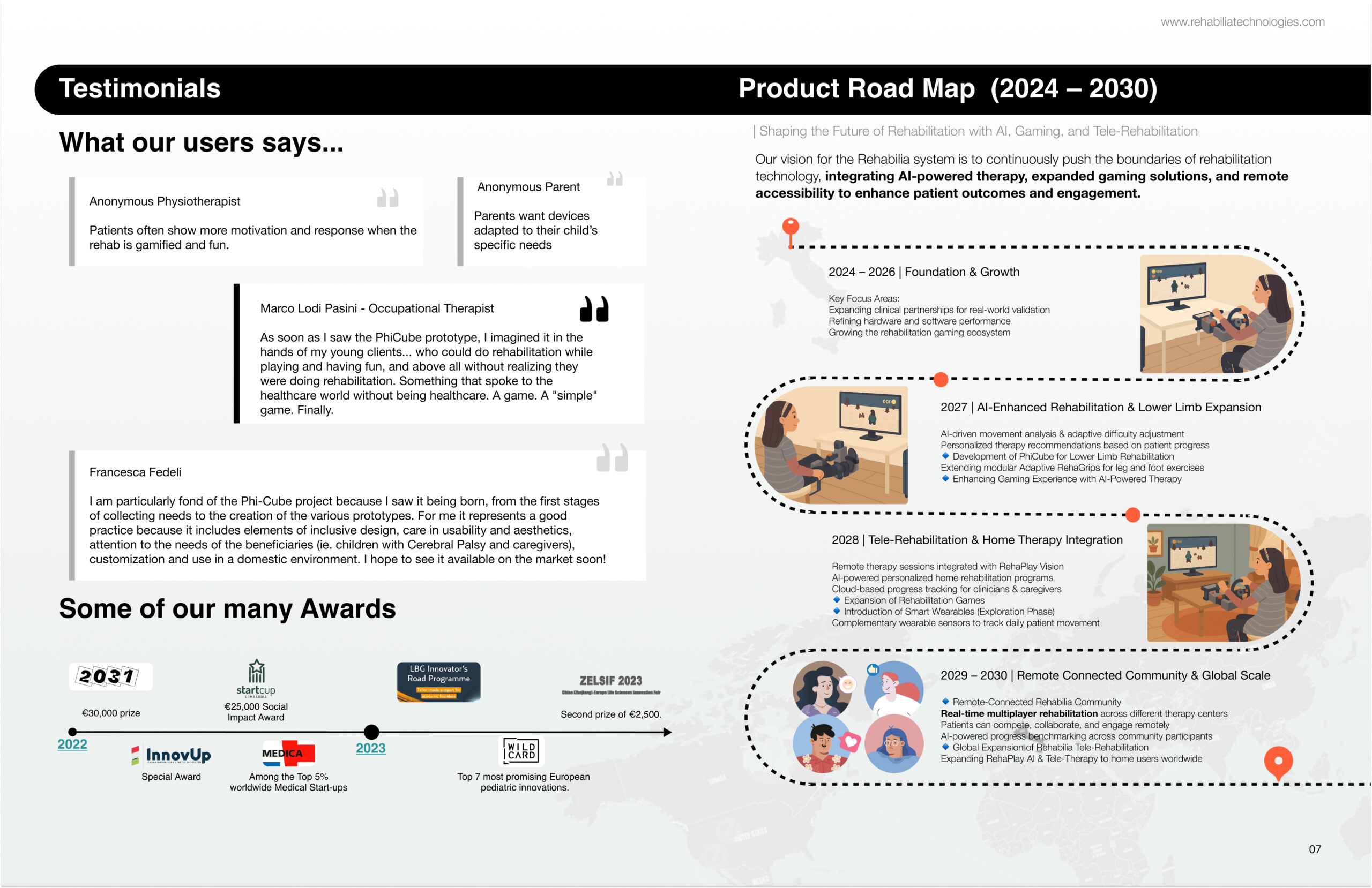
The interactive catalog.

Each page followed the same logic:

Product name → Real photo → User benefit → Technical specs → How it fits in the ecosystem.

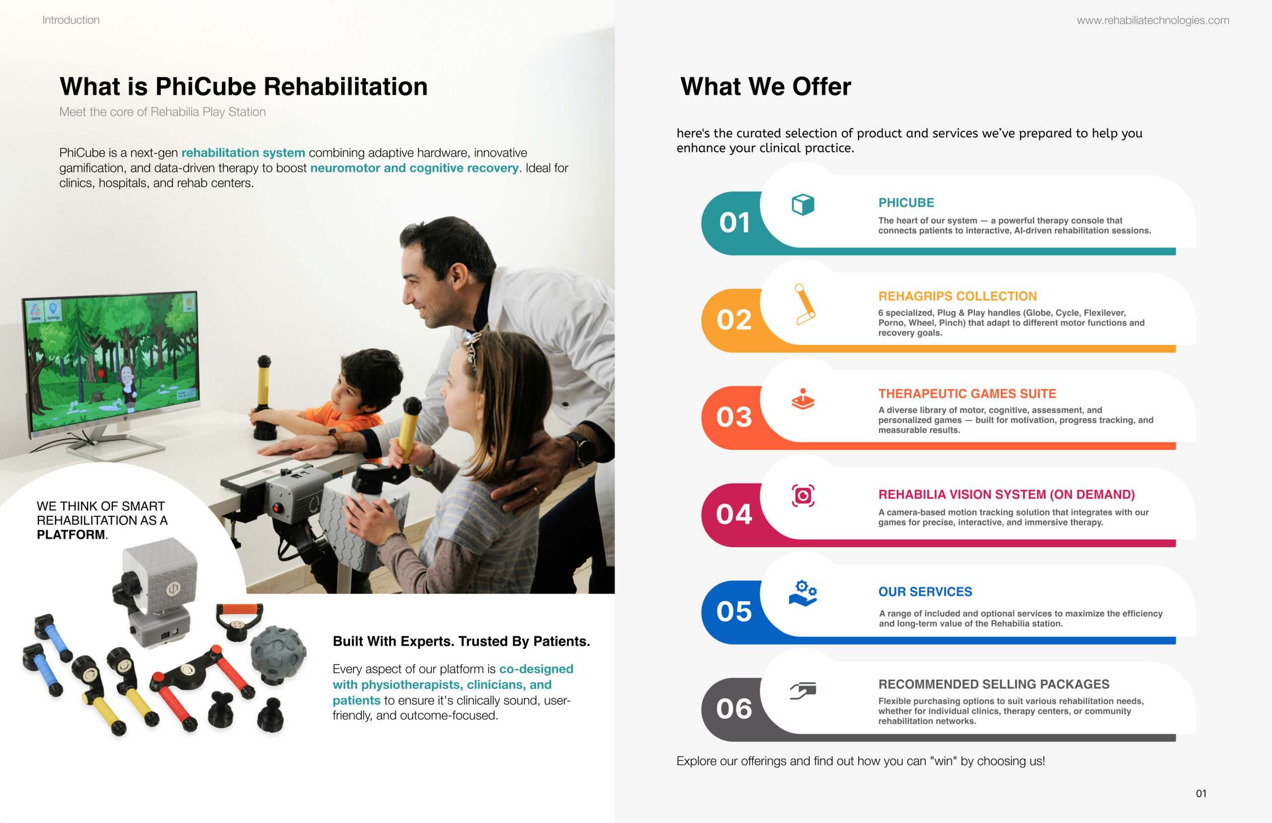
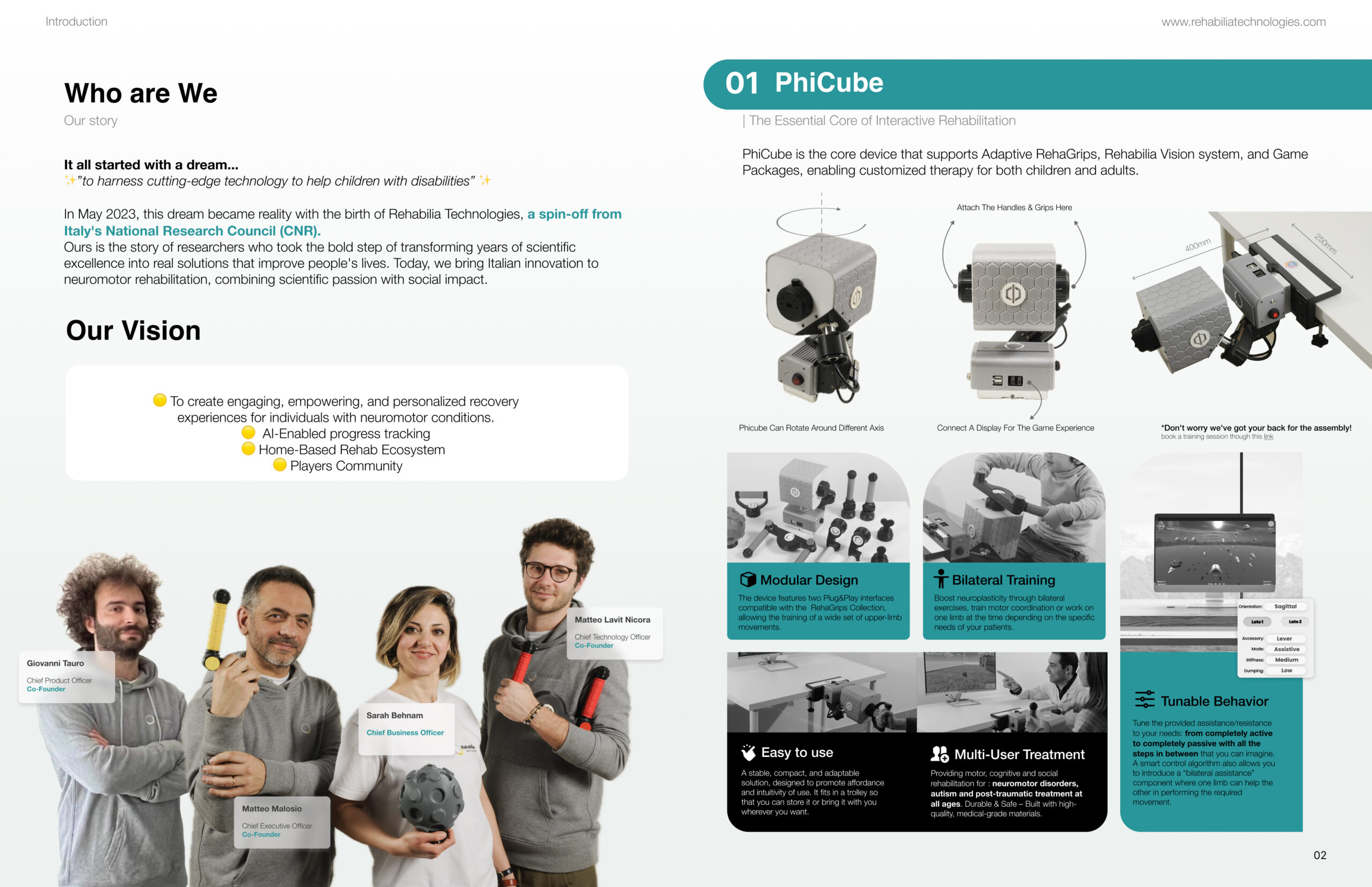
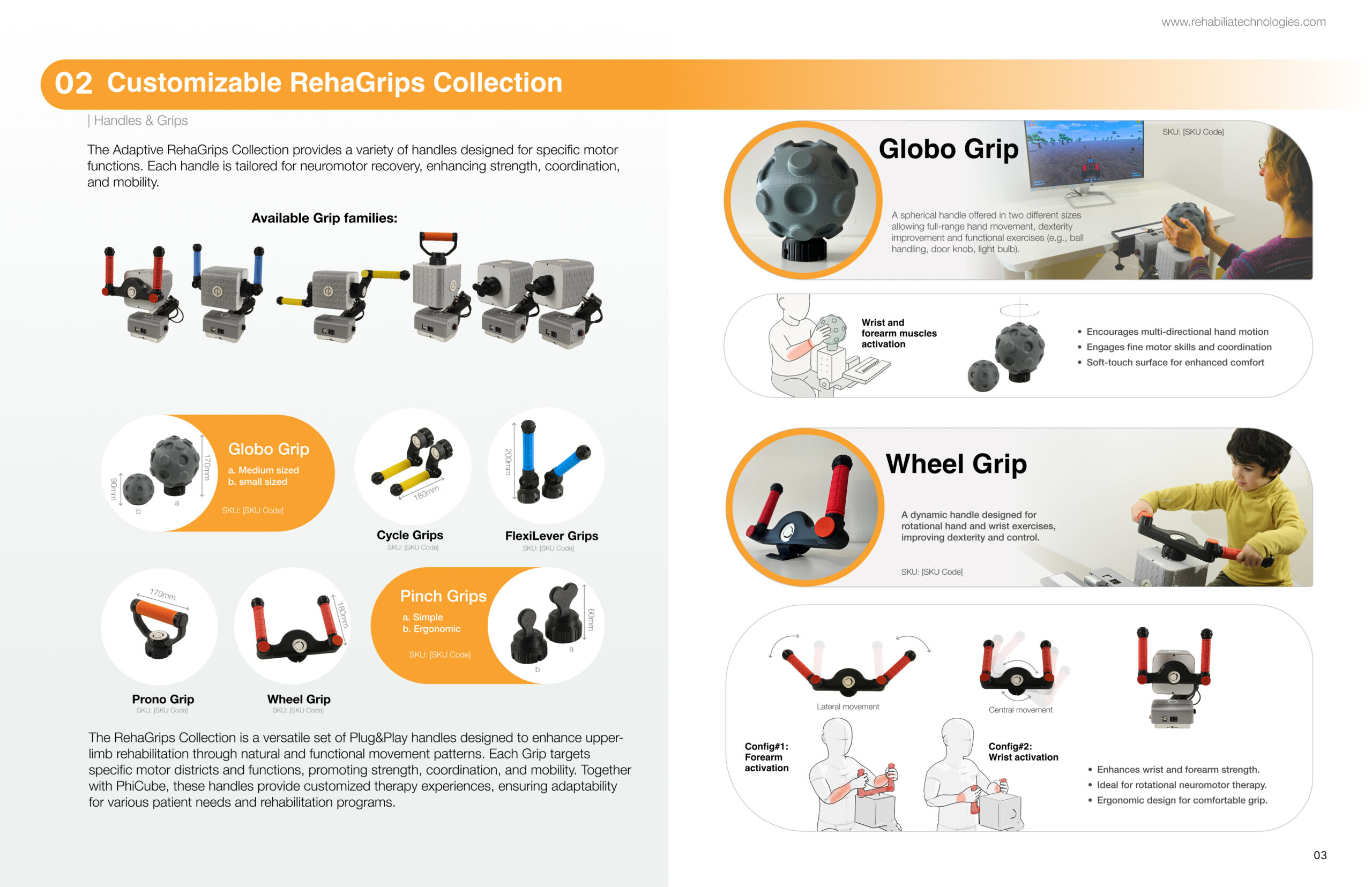
Rehabilia Interactive Catalog

Explore all 9 pages of our product & service catalog

Page 1
Page 2
Page 3
Page 4
Page 5
Page 6
Page 7
Page 8
Page 9
1 / 9
Page 1 of 8
Use arrow keys (← →) or click buttons to navigate
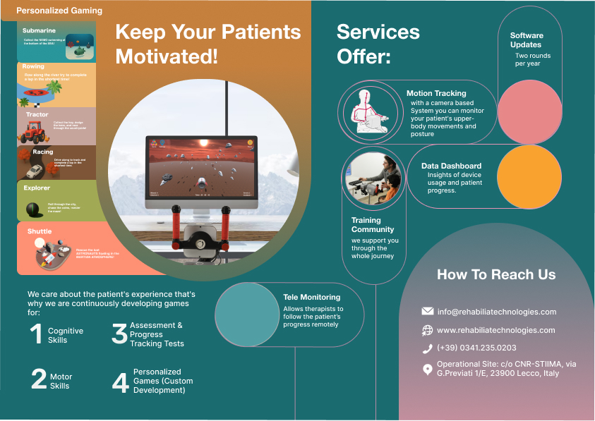
9-page catalog showing product architecture, modular handles, game library, vision system, and 4 pricing tiers

Step 3: Simplification

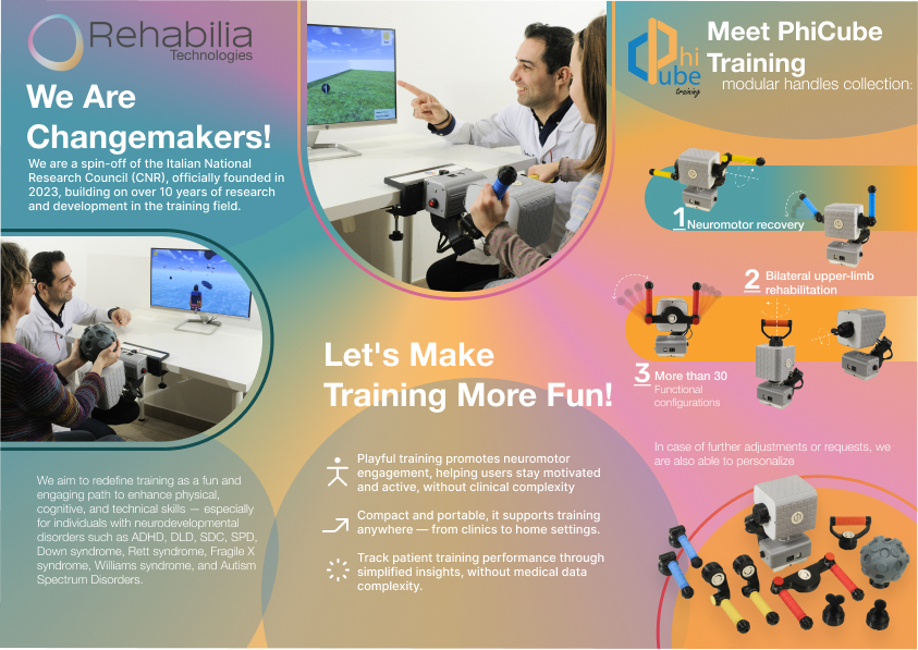
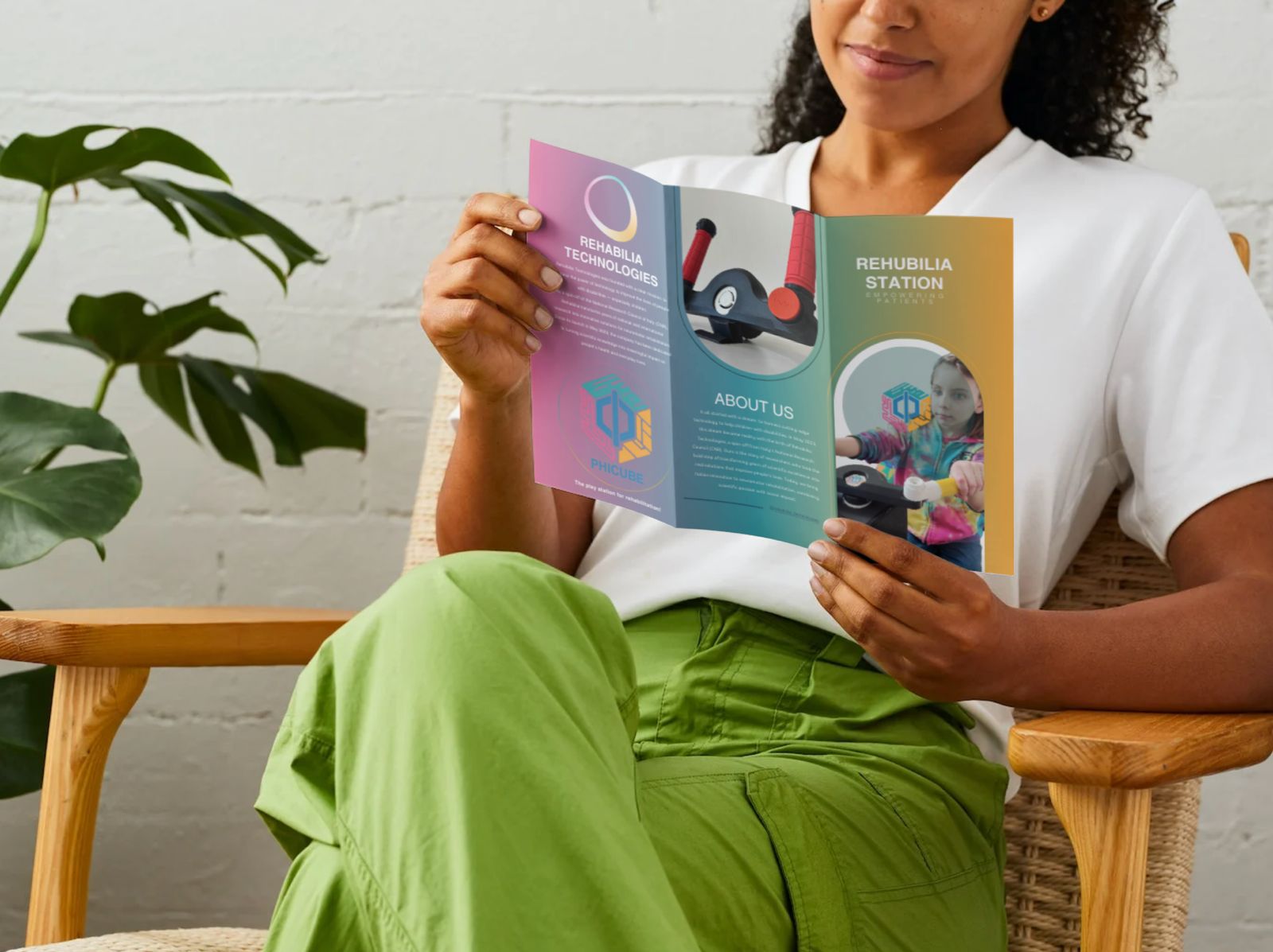
Condensed into a one-page brochure

The catalog is comprehensive. But salespeople need something they can print, fold, and hand to a clinic director in 30 seconds.

We took all the catalog intelligence—product architecture, pricing logic, service tiers—and distilled it into a single-page trifold brochure. Every decision was intentional. No fluff. Only what matters.

One-page trifold brochure deployed to all demo visits

Result

Sales-ready materials one.

In 3 months, we equipped Rehabilia with cohesive GTM materials: a website that educates, a catalog that demonstrates complexity without overwhelming, and a brochure that closes conversations.

Today, the sales team uses these materials across 10+ demo visits. Each one is informed by the same architecture. Each one tells the same story.

Want to see how I'd do this for your product?

Scroll to Top