UX / UI · Visual Design · Conversion Journey
Enpal Italy — from awareness to action.
MY ROLE
UX/UI Designer
Duration
3 weeks
Team
Solo Freelancer in collaborate in on-site team
Tools
Figma, Nanno bnnana gemini Firefly, ChatGPT
One journey, from the first ad to the final submit
I designed a complete user journey for Enpal Italy — from social-media ads, to the landing page, to the savings-calculator form. The aim was to carry Enpal's brand values — sustainability, affordability and family well-being — through every step, turning ad awareness into a smooth, trustworthy path to action.
The challenge:
Italian families are skeptical about solar. The hardest part of a solar panel isn't the ad or the form — it's the drop-off between. People click an aspirational ad, hit a cold, pushy calculator, and leave. My approach: user empathy over pressure.
My approach is user empathy over pressure.
The Full Flow - The Solution
One journey, three touchpoints
Social awareness by Advertisment
Emotional connection through aspirational messaging.
Goal: Click through to learn more
Landing page clarity
Emotional connection through Show what Enpal is, why it matters, how it works → Build trust
Goal: "I'm ready to see if this works for my home"
Calculator form Conversion
Conversational questions → Personalized results → Lead captured
Goal: "I want to talk to Enpal"
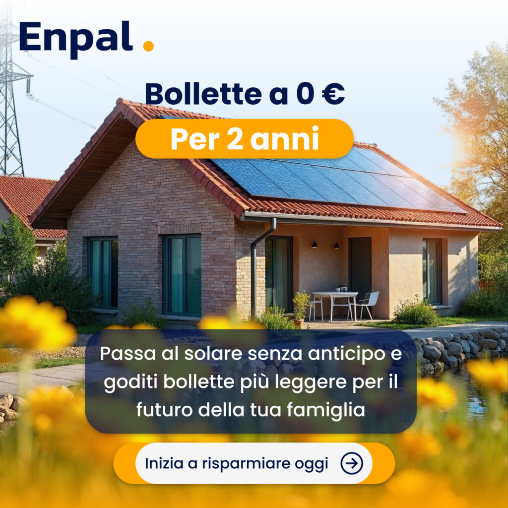
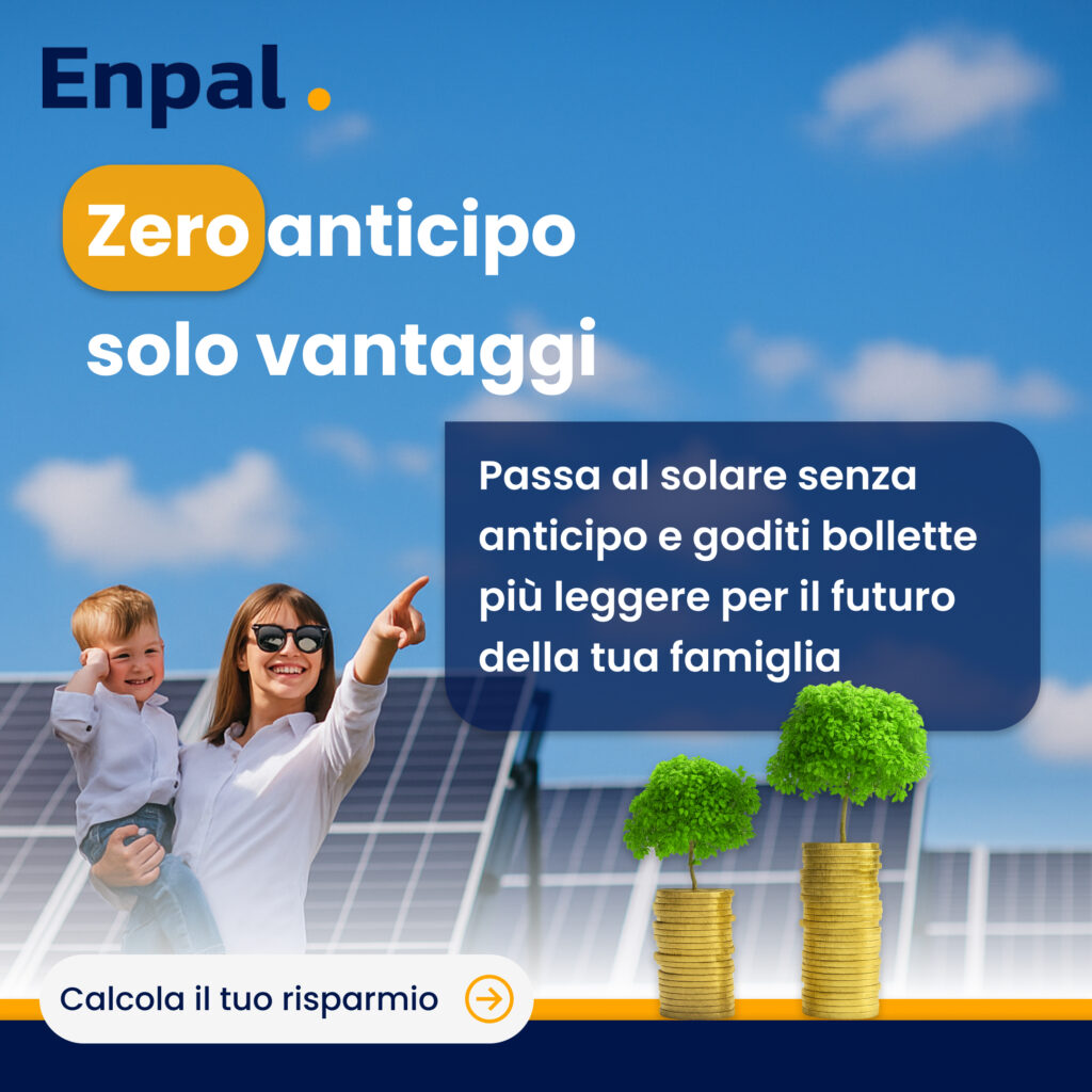
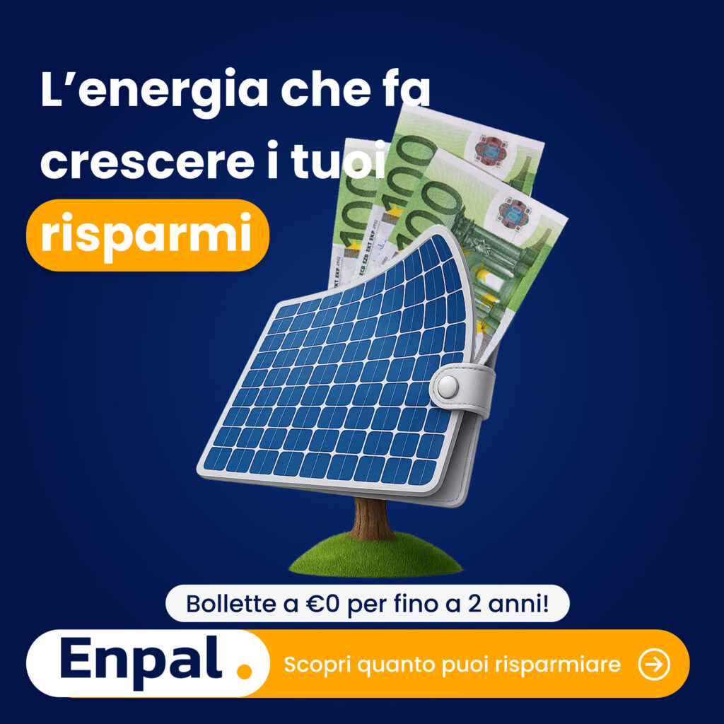
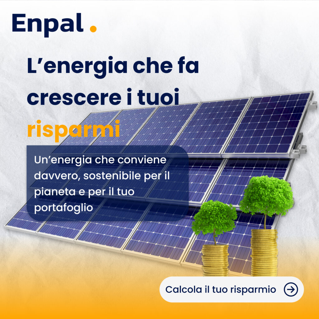
Contribution 1: Advertisement Campaign
Campaign: "Zero bollette, zero pensieri".
Strategy: Visually connect three core benefits (no upfront costs, lower bills, greener home) to family happiness and peace of mind. I created warm, aspirational imagery using Enpal's brand colors and design language.
Design approach:
Bold typography with orange/yellow accent for key message ("risparmi")
High-quality imagery: solar panels + family moments + money/savings symbols
Conversational tone in Italian, emotionally resonant
Clear CTA: "Scopri il tuo risparmio" (Discover your savings)
Metrics
6.8% click-through rate on social (TikTok, Instagram) — 70% above industry average
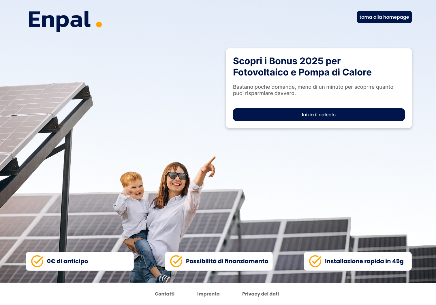
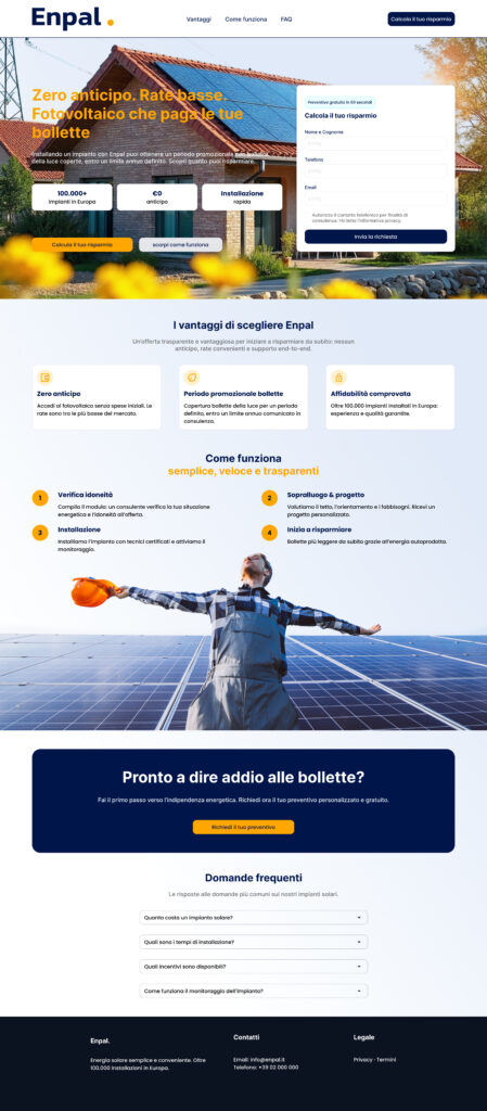
Contribution 2: Landing Page
Strong Storytelling + Functional Clarity
Strategy: The landing page had to do two things simultaneously: showcase the solar product (tangible) and communicate service value (intangible). I designed it to immediately answer "What is this?" and "Why should I care?" before asking for action.
Key sections designed:
Benefits row: Three core advantages with icons (Zero anticipation, Flat rate for 2 years, Comprehensive affordability)
Process section: "Come funziona" (How it works) with 4 steps, emphasizing simplicity and transparency
Trust section: Real installer image + testimonial language
Metrics
28% conversion rate (visitor → calculator start) — 27% above industry average
Contribution 3: Calculator Form
Empathy Over Pressure
Challenge: Forms are conversion killers. The original Enpal form was long, technical, and felt like a sales interrogation. Users dropped off because they felt rushed and uncertain.
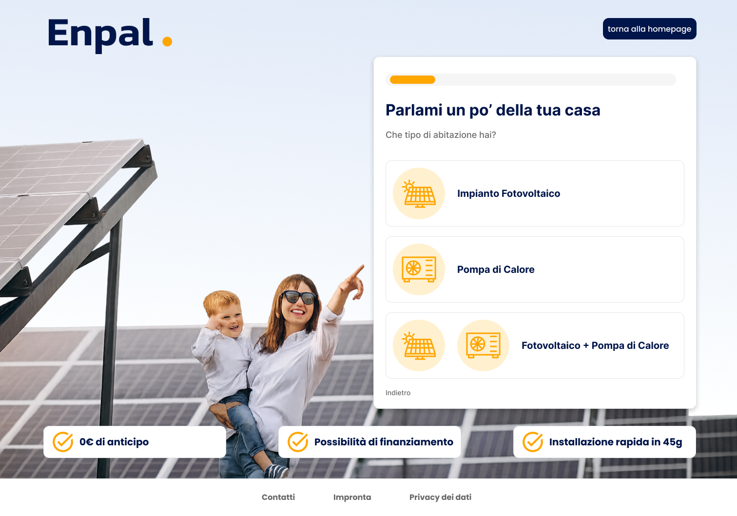
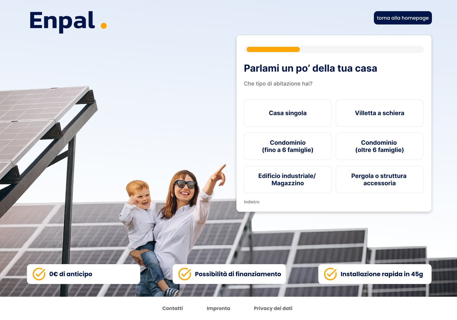
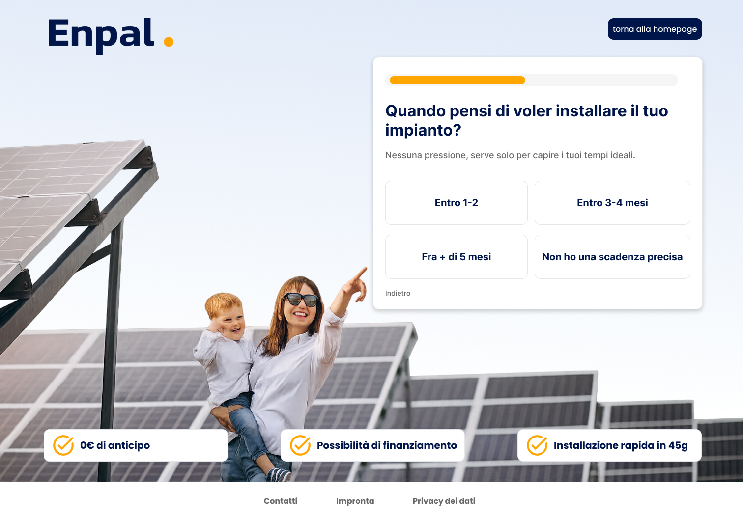
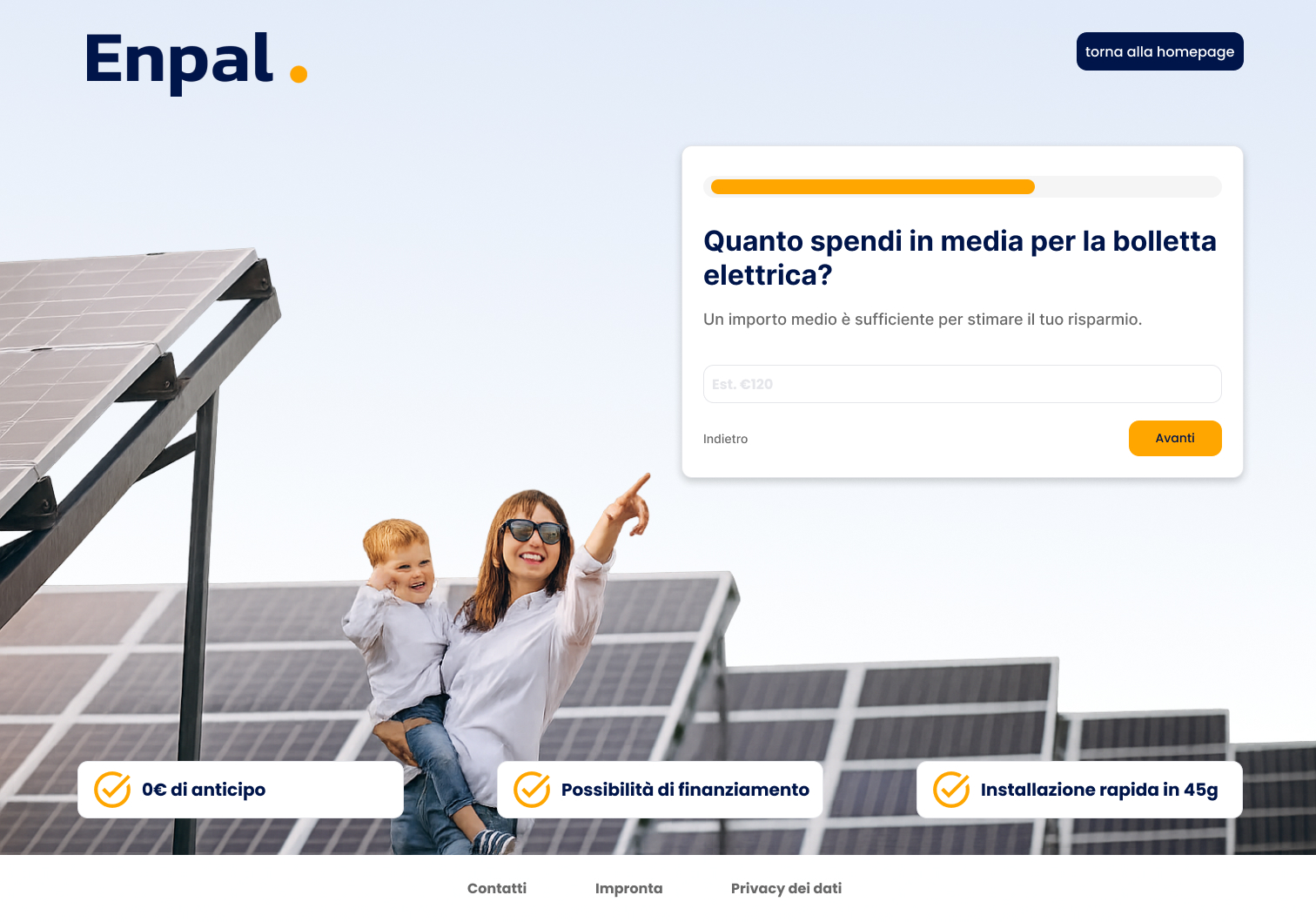
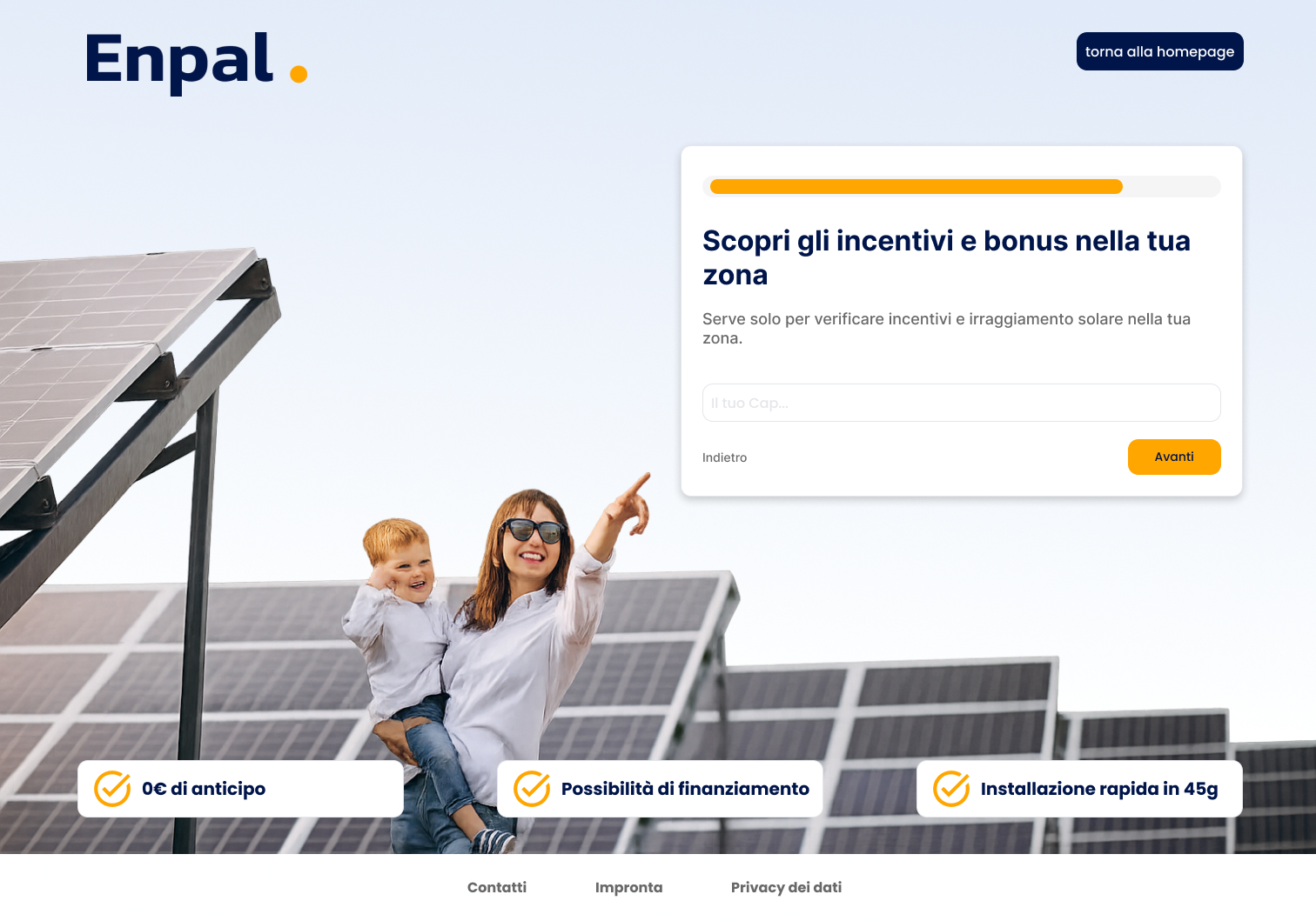
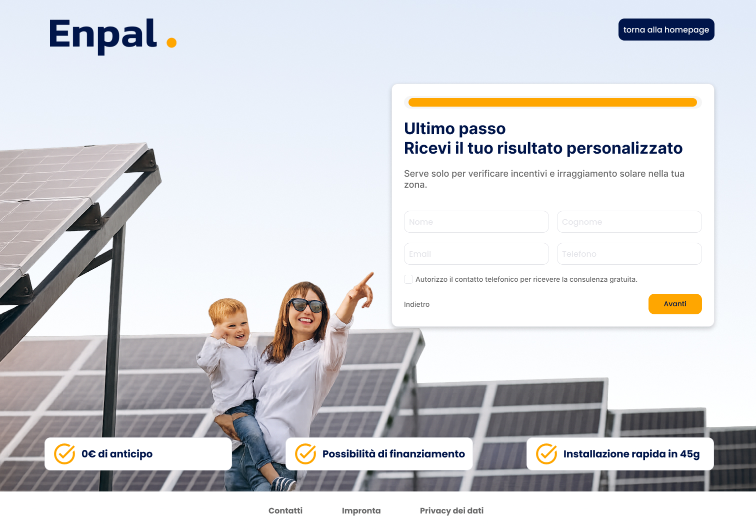
My approach: Redesigned as a conversational journey, not a form. Each step asks one thing, shows progress, provides instant feedback, and maintains visual consistency with the landing page.
Key UX decisions:
Step-by-step flow: Progress bar shows where they are (e.g., "Step 3 of 6")
One question at a time: Reduces cognitive load
Visual consistency: Same hero image (family + solar) on every step — builds familiarity and reduces anxiety
Conversational copy: "Parliami un po' della tua casa" instead of "Enter property details"
Personalized results: Final step shows their custom savings calculation, not a generic message
Micro-interactions: Highlight selected options, show confirmation, animate transitions
Form sections designed: Roof type selection • Home characteristics • Current energy bill • Installation timeline • Contact information • Personalized results
Metrics
70% completion rate (vs. 55% baseline) — 27% improvement in form completion
My Point of View
The biggest idea, carried by the simplest one.
Solar energy is simple. The service is simple. But the industry makes it complicated with jargon, fear-mongering, and pushy sales tactics. My belief: people want to understand what they're getting, feel respected, and move at their own pace. Design should make the complex feel simple, not intimidate users into feeling stupid.
For Enpal, that meant:
Real imagery (families, homes) over technical diagrams
Italian, conversational tone over corporate English
Show the benefit (peace of mind, savings) before the product (panels)
Celebrate progress in the form ("You're 2/3 done!") instead of guilting users
Reflection
Consistency of feeling, not just of visuals.
Conversion is about consistency of feeling, not features. The 70% form completion came from treating every touchpoint as a conversation—consistent tone, conversational copy, real visuals. Three weeks of constraint forced ruthless prioritization: every choice had to move users forward. Repeating the hero image across the funnel felt redundant but anchored trust. The insight: small UX choices (one question at a time, progress visibility, real families over specs) compound into dramatically higher conversion rates.